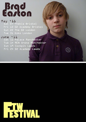
I created the first half to advertise a music tour by Brad Easton, the same artist which I used on the front cover. I liked the shadow which was cast by the artist and the lighting on a blank white wall, it created a really professional look but also minimalist and modern, suitable for the young audience of my magazine's target audience.
I used a curvy minimalist font which complimented the minimalist image, I also used the dropper tool to choose a colour in Brad's top as the same colour for the font. I created to different individual layers for the words Brad and Easton so that I could rearrange them separately. This effect is eye-catching and creates a logo for the artist which could be recognised easily.
I took some creative and imaginative movement pictures to use in the second part of my split page advert, I love the body positions that this created, and used the same style to create cohesion from the front cover and of the genre of music being represented by using the same person and idea of blanking the face to create a mysteriousness.


WOW!! This is really good I love how the coloured people are slightly transparent so that you can see through it to the other picture, a really artistic photo I think with the kid in mid air!!
ReplyDelete