Barnardo's: Their adverts send a completely different message to balloon angels, unlike balloon angels, the images are darker and more depressing, creating the audience to feel guilty and then act.
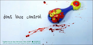
NSPCC: Their advert conveys the same kind of guilt-tripping, sad emotion as barnardo's, yet by using a close-up picture it connects the child more with the audience. However, by excluding a setting we, as the audience, know nothing about this girl's situation but with a simple Iconic 'mute' symbol we assume that she's the keeper of many secrets. My favourite style of advertising is Barnardo's because I think it makes the biggest impact on me, I feel guilty of the quality of life I live compared to these unfortunate children which makes me sympathize, and want to be part of making a difference.

 These are images which I have taken from their website. I'd like to create my own advert in the style of the dark, morbid, bleak barnardo's in order to raise a larger awareness.

 My pictures: I took many photographs in the snow during lesson time when there was nobody around which portrayed the loneliness of being homeless at Christmas, a time when everyone forgets other's misfortune. These two images were my favourite from many. I chose my favourite picture then uploaded it onto the computer where I opened it in photoshop to make some artistic changes.

 Firstly I changed the filter of the image by going to filter - artisitic - posterize to get this rough and edgy effect on the image. Secondly, by using the same image (copying another layer and hiding the original one) I converted the colour scheme to black and white by clicking Image - Adjustments - Black & White. Then with each seperate layer visible, I hid the posterized image by clicking the eye shape next to the specific layer. I cut out the image of Aston in black and white by using the quick selection tool and then deleted the background by selecting the inverse and pressing the delete button on the keyboard. I then made the posterized image visible again making sure that it's layer was underneath the black and white layer.
 Finally, by research on posters I inputted the charity's logo, contact information and a slogan to give the audience an insight on the charity's aim.


No comments:
Post a Comment