


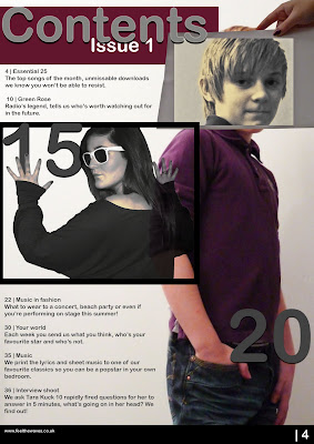
These are my original photographs that I took of my brother, I played around with using different camera angles which I could use for different aspects of my music magazine. This image is the one that I thought would be most suitable for using on my contents page as there is space for a title at the top, features down the side but keeps the attention on the main feature - Brad Easton, a new modern/indie star who fits in perfectly with my magazine, and appeals best to my target audience who are also interested in this genre of music, from a younger age range. I chose to use a blank white background because this would emphasise the colours that the artist is wearing but also the minimalist look which connotes the indie genre of his music, this was influenced by the photoshoot I found on Q's website, I used lighting to create the gradient from bright to dark in the background.

I emphasised the colour of the image to make it look more appealing and fun. This effect was create by converting the image into LAB color instead of RGB, which I changed by going into Image > Mode > LAB Color. This divides the image into 'Lightness', 'a' and 'b' layers instead of RGB which by selecting the individual layers and changing the contrast levels will cause the colours to become emphasised.
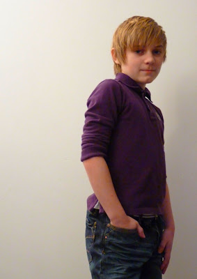
I played around with the adjustments until I found a image which I was happy with.
 Liams Face:
 In photoshops I selected an area to fit within the paper of Liam's face, I then hid the layer of the paper image by clicking on the eye icon.
With only Liam's face selected I copied the selection by right clicking and chose 'layer via copy'.
Focusing on this layer, which I deselected (Ctrl + d), I right clicked on the visible layer and chose 'colour range...' I changed the selection to 90 instead of 17, and by using the eyedropper tool selected the brightest part on his face. This tool then selected all of the areas of the same colour, which I then filled with the colour e6d6a0.
Without deselecting, I selected the inverse (Shift + Ctrl + I) and desaturated the layer (Ctrl + Shift + U). With the layer as I wanted I then re-clicked the eye tool to show all the layers together.
I repeated this technique for all the image I used on the contents page which allowed the purple title and clothes of Liam to stand out, it also portrayed the genre of music throughout my magazine which is modern pop music with a quirky indie/retro style.
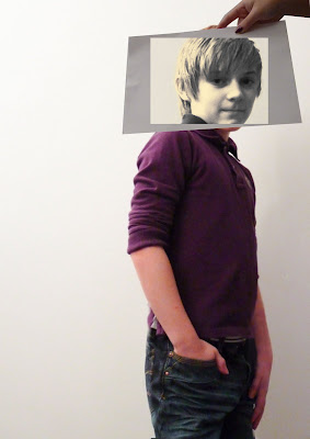
These images below show how by applying the technique to the photos made the page look more professional and effective in catching the eye, I used it on all the photos which represented sections of the magazine to give an insight.
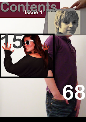
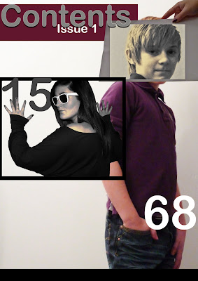 I also added a title for the page - I used the same font to create cohesion throughout the magazine, I also kept the colours minimalistic but that complimented the colour of FTW, which I used on my front cover. The same techinque is used in magazines like 'Q' where they keep the colour scheme strictly red. I changed the outer glow and shadow of the text so that the title stood out eventhough being a subtle colour, and it also added to the contrast of indie and modern music I am portraying.
I also started to look at finer details such as page number, a border at the bottom of the page and information of the features included in a text format.
No comments:
Post a Comment