


Here are some of the photographs I took which I thought were appropriate for a double page interview on a musician. This artist, "JSpark", performs the genre of indie/pop which works for my magazine as it appeals to the same target audience. Furthermore, the photograph needs to portray the style of her music, so I decided not to use images which contained guitar smashing, dark images or screaming faces which would represent attributes of a rock star, or using images including metallics, bold colours or quirky faces which would portray rap/hip hop styles. Instead I used casual, friendly and natural images which is the stereotypical representation of an indie artist, because of their adoration for music rather than the money they make which I will also add to the interview.

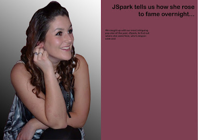
Considering the previous statement, I chose this photograph to use as the main image which will take up a page of the double page spread. I like how 'JSpark' is sat in a natural position and smiling as if it was taken during the interview I'm writing.
I converted the background of the image by using the pen tool, drawing around the outline and selecting the image. I then copied the image of JSpark, forming a new layer and inserted a new blank layer underneath which I then used the gradient tool to create the faded effect. I think this makes it look more professional. I began to attempt creating a layout for the writing, experimented with the background colour, and with the different fonts.
I decided that a white background contrasted the most with the text and therefore stood out and looked the most appealing to read. I also used the same font as used throughout the magazine, in the masthead, the contents etc. so as to create cohesion throughout my magazine making it easy to read.
From the last step to here I did a lot to transform the appearance of my subject in order to create the effect of a professional modelling picture, therefore I changed the brightness, shadows and highlights. Also, I used the clone/stamp tool to create fuller hair and create an appealing designer look, such as that of Cheryl Cole or Adele. I like how this effect compliments the monochrome background which blend well so that the photoshop adjustments aren't noticeable.
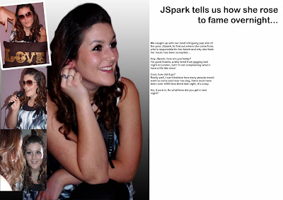
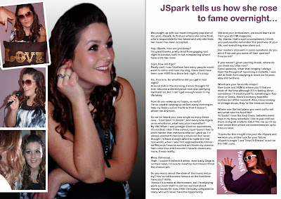
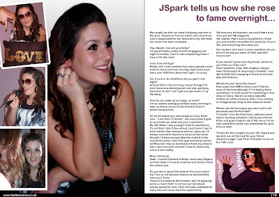
Another alteration that I made to the double page spread was adding a column of 3 smaller images down the edge of the page. This filled space which looked too empty but also looks fun and quirky, portraying different personalities and scenarios of an artist's life in an artistic way.


 I completed the final touches such as the page number, bar along the bottom including the website.

I completed writing up an interesting interview in which I inputted reader's questions that they had sent in to allow for contributing audience's ideas to make them feel part of the production of the magazine.
I also created an album cover for JSpark's music, therefore did research into an array of artists that are known for the same genre and aimed at the same demographic as my magazine.  From this selection of album artwork it's clear that close up shots are used and aren't necessarily looking at the consumer unlike the conventions of a magazine front cover. Furthermore the adjustments show how the colours have been intensified and there is a glow about the artist, all of which look deep in thought rather than smiley.
 From this selection of album artwork it's clear that close up shots are used and aren't necessarily looking at the consumer unlike the conventions of a magazine front cover. Furthermore the adjustments show how the colours have been intensified and there is a glow about the artist, all of which look deep in thought rather than smiley.
I adjusted my image as described;


This effect made the model look more like a pampered celebrity, and the pose is really powerful so I think it makes a big impact and reflects someone who the reader would like to read an interview about.
I then added text in the software 'Publisher', Publisher allowed me to draw where I wanted the text to go and in what shape therefore I could use the layour to fill the background. I think my final image was creative and wouldn't look out of place against the other CD artworks in shops or online.
 I completed the final touches such as the page number, bar along the bottom including the website.