Tuesday 19 October 2010

Double Page Spread - Best Things About Sixthform

This double page spread will appear as the first article in my magazine, it tells students of year 11, (who are thinking of returning to do their a levels at sixthform,) what they can look forward too. But also when students of year 12 read the article, (who are already in sixthform,) they will be able to relate to the points raised, giving them the opportunity to aggree or disagree, therefore getting involved.
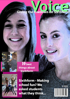
I chose these images specifically to show the students, (Abi and Sam,) enjoying their studies which would give out a enthusiastic vibe, therfore making the reading more enjoyable for the sixthformers. Also I chose not to write the list in a structured, perfect way so that by laying them out in jumbled, bullet points it gives a shorter, younger and easier approach to reading, for quick updates in break times.

Contents Page

I made my contents page simple but bold, this effect draws in the readers attention which is necessary for the first page in my magazine. I used this image of Lucy and Lucie to create a brush tool which I then duplicated in white, light blue and dark blue on top of each other to give a dramatic and modern background. I kept the color scheme blue, carrying on from the front cover to show coherence throughout the magazine.

Final Front Cover

I named my magazine 'Voice' as it could be recognised by the audience (the students), the name is also rememberable and will then be the main discussion of the sixthform block, whilst everyone catches up with eachother. The 2 main stories of this week's magazine are the '10 best things about Sixthform' and 'Sixthform - making school fun? We ask the students what they think,' a selection of interviews with students by students to reveal the real truths. I used photoshop to put together the front cover and therefore tried to get the page looking professional, which would increase the appeal to our students.
Firstly, my completed magazine cover looked like this image (above). However, I felt that this cover would appeal more to girls than boys, mainly because of the colour scheme, so I then decided to change the pink to blue using photoshop.
I think this colour scheme works better, it would now appeal to both girls and boys, therefore completing that part of the brief.